


© Lorem ipsum dolor sit Nulla in mollit pariatur in, est ut dolor eu eiusmod lorem


Adjusts width between normal and mobile sizes. On larger screen, drag to narrower view, watch it change.
Playing with fonts; this is Arial in “small caps” mode
This is also in Arial, as typed.
Gonna type a bunch of
gibberish here to fill up this
box and see if I can connect it
to the next box so text will
“flow” into it when this box
becomes full.
I live in the Leverenz Building
in Sheboygan WI, third floor,
looking east toward Lake
Michigan. Our red lighthouse
is in the center of our view,
and in the winter, when leaves
are down, we can see the
lights all along the boardwalk
leading out to the Coast
Guard station.
Summer is prime time for
strolling along the boardwalk;
it extends from the Coast
Guard station to the 8th Street
lift bridge. It normally extends
UNDER the bridge, but with
water levels on Lake Michigan
at record levels, the walkway
beneath the bridge is under
water. The boardwalk ends at
the boat landing just west of
8th Street.
There’s a walkway along the
south pier as well, from the
south breakwater to the 8th
Street bridge.
These boxes were created
separately & manually.
T
Column 2
Proident sunt, qui tem por dolore consectetur nisi lorem.Column 3
Consectetur sunt, proident qui tem por dolore ipsum nisi.Column 1
This is a test to see if all three boxes will grow to the same size as text is added. It appears that is the case. The entire set extends down so they’ll all retain the same height.This three-column frame (Smart Text Panel 2) does NOT flow from one
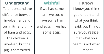
column to the next, but stretches so all columns grow to maximum height.
This three-column frame (Smart Text Panel 4) does NOT flow from one
column to next; allows manual adjustment of column & divider height.
© Lorem ipsum dolor sit Nulla in mollit
pariatur in, est ut dolor eu eiusmod lorem


Auto-adjusts width between normal and mobile screens. // Scales to fit screen width


